“We made the buttons on the screen look so good you’ll want to lick them.”
— Steve Jobs

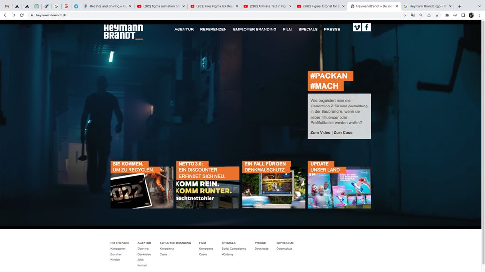
Onboarding Site Analysis.
The Idea aimed to redesign the onboarding page of HeymannBrandt to improve user experience by reducing cognitive overload and preventing user confusion. The initial step was a thorough analysis of the old onboarding page to understand the volume of information presented and how users interacted with it. The analysis helped identify pain points where users were overwhelmed by excessive data input and instructions all at once.
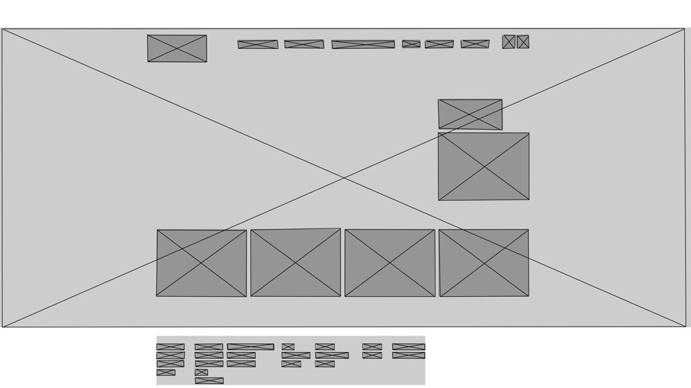
Concept.
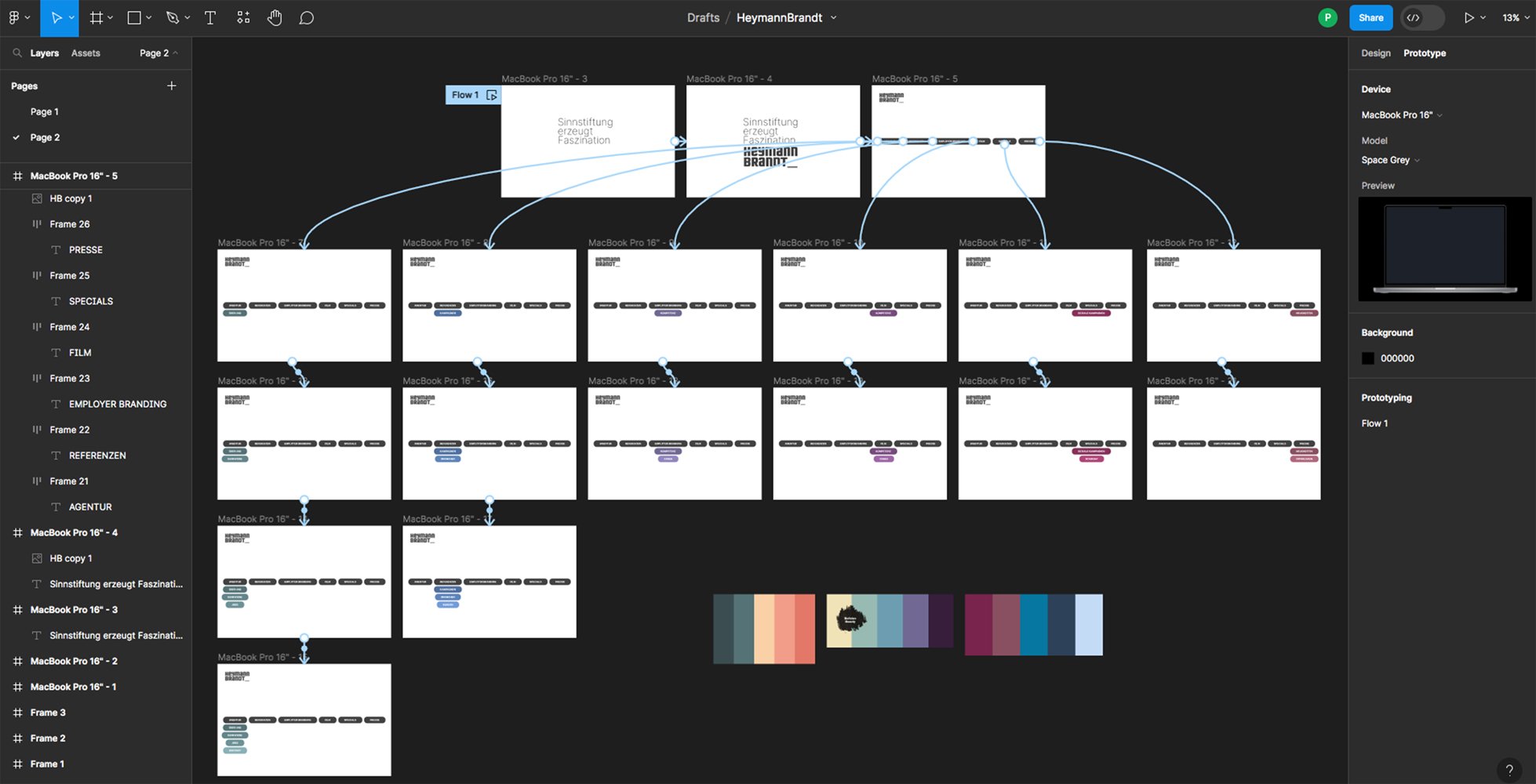
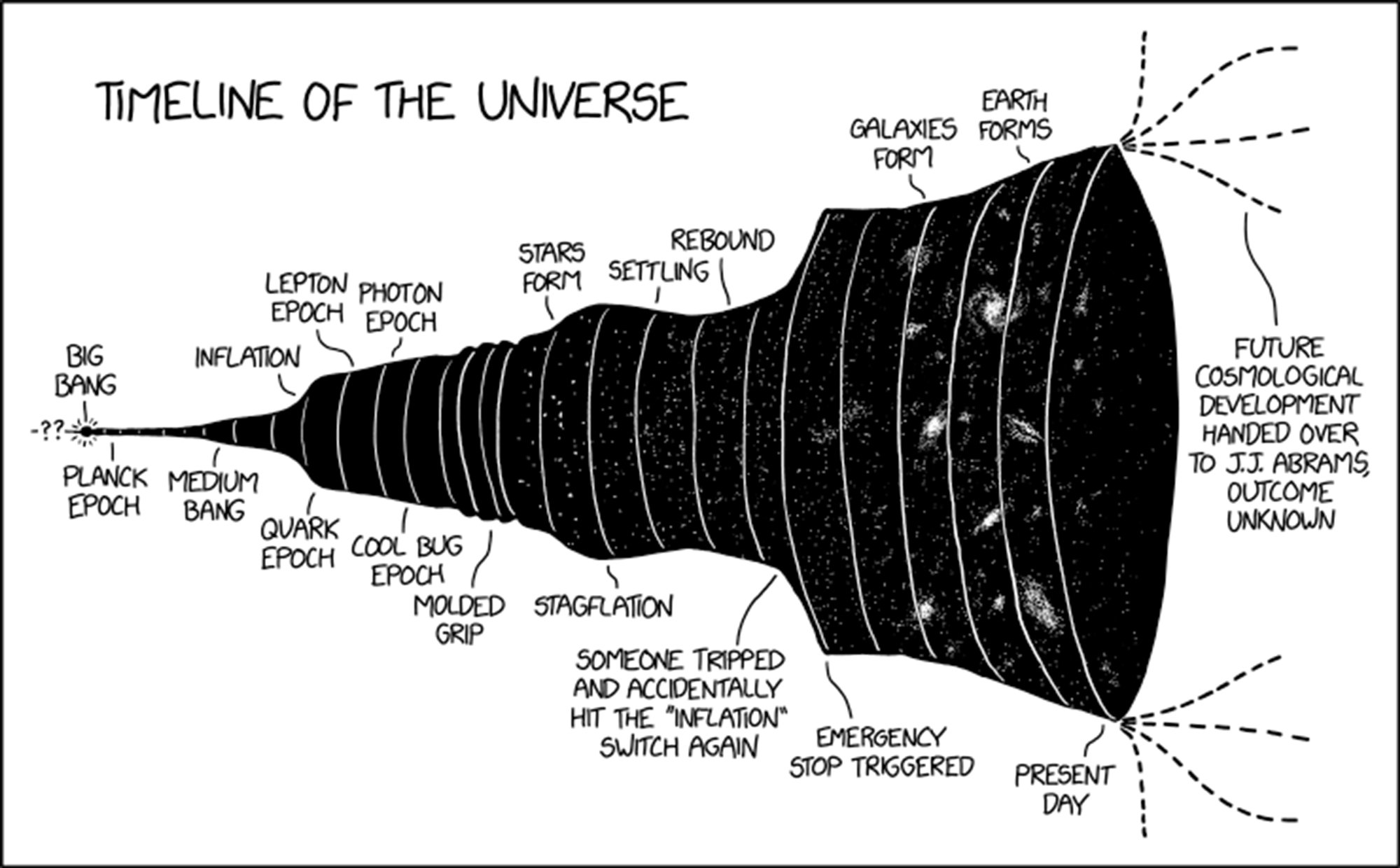
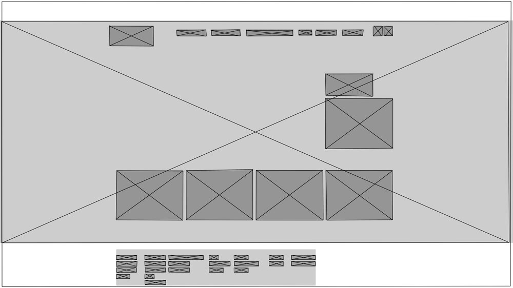
The new design approach drew inspiration from the "black hole" principle—starting with a minimalistic, focused entry point and gradually revealing more information and options as users progress. This strategy informed the information architecture, ensuring a more streamlined and organized flow of content. The onboarding process was restructured into a progressive disclosure model, where users are guided step-by-step, only encountering relevant information and tasks when needed.
Idea Low Fidelity.

Idea Mid Fidelity.


Figma Structure.
