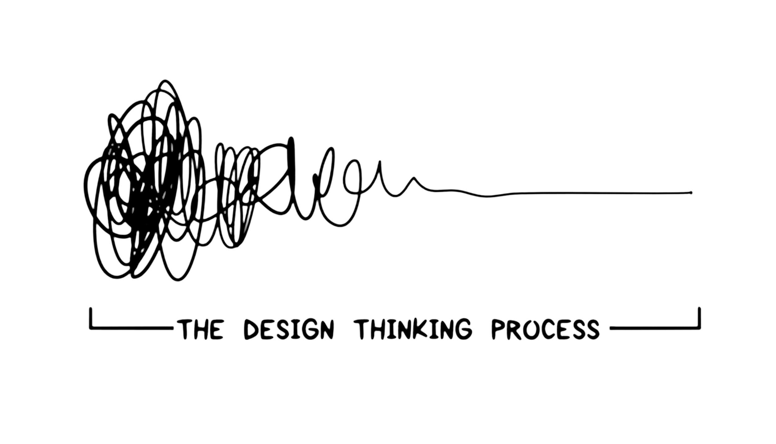
“Genius is the ability to reduce the complicated to the simple.”
— C.W. Ceram

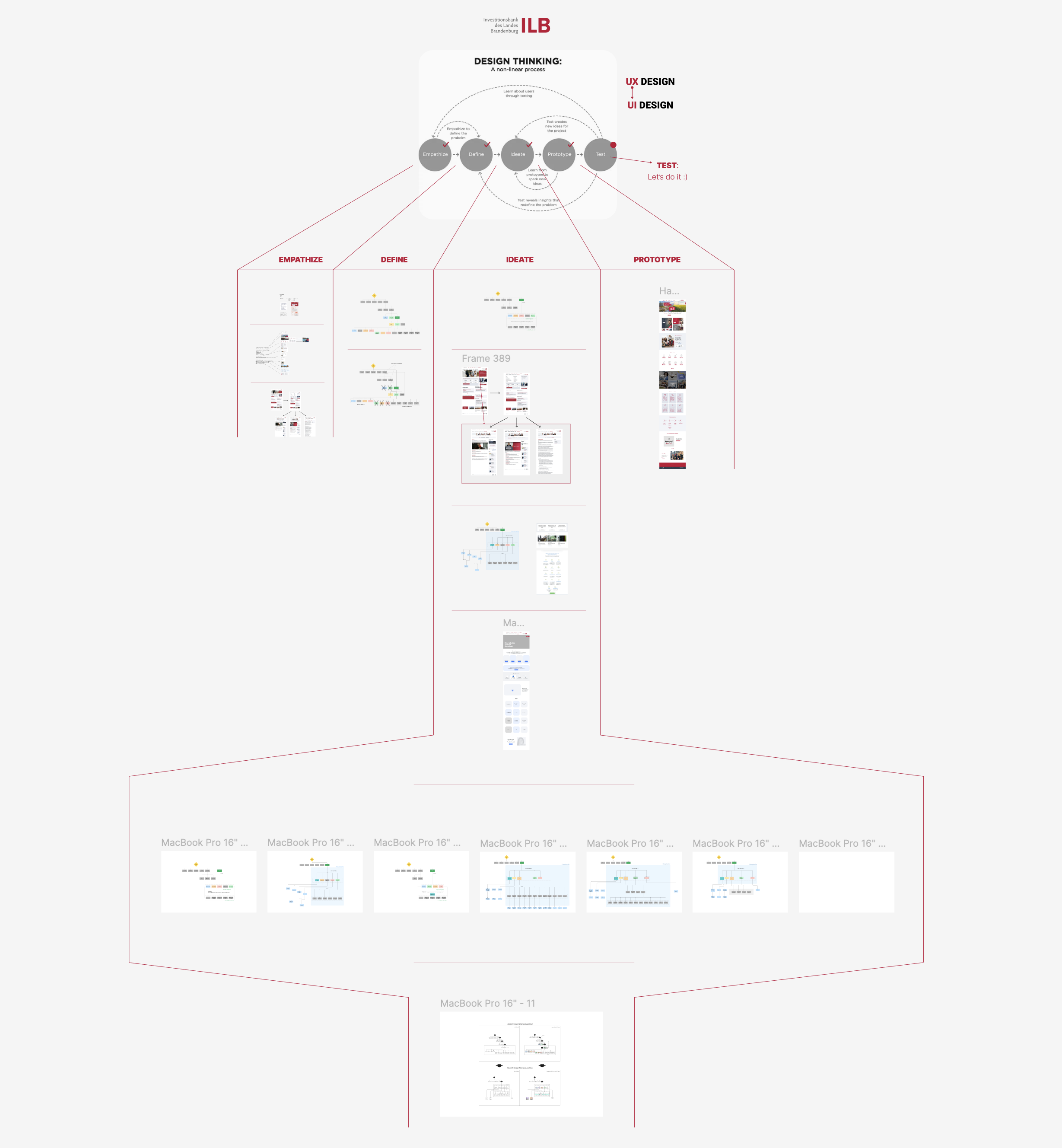
The ILB career page reconstruction followed a design thinking process to create a user-centered and efficient solution that simplified navigation and improved the overall user experience. The original website had a convoluted user flow that made it difficult for users to locate the career page, leading to frustration and inefficiency. By applying the design thinking methodology, I was able to tackle these issues in a structured and thoughtful way.


1. Empathize:
Understanding User Needs and Client Goals
The process began by gathering all relevant information from ILB. I engaged with stakeholders to collect insights into their objectives and the needs of users visiting the career page. This included identifying key pain points and understanding the primary goals users had when interacting with the page. By listening closely to their feedback, I gained a clear picture of what users were struggling with and what the company wanted to achieve with the new design.
2. Define:
Analyzing the Existing User Flow and Sitemap
Next, I conducted a thorough analysis of ILB’s old user flow and sitemap, where I found numerous inefficiencies. Many pages were redundant, with some information being repeated two or three times, leading to unnecessary complexity. This step allowed me to identify the core problem: users were forced to go through multiple layers of navigation just to reach the career page. I defined the key challenge as simplifying and optimizing the journey so that users could access the page with minimal effort.
3. Ideate:
Creating a New User Flow and Sitemap
Based on my analysis, I proposed a new user flow and sitemap that streamlined navigation and made the career page more accessible. The new flow removed redundant pages and reorganized the site structure, ensuring a logical and direct path to the career section. The updated sitemap was designed with user experience in mind, reducing friction and making it easier for users to find relevant information. In this phase, multiple ideas were explored, but the focus remained on delivering a clean and intuitive user journey.
4. Prototype:
Building Mid-Fidelity and High-Fidelity Prototypes
To validate the new design and ensure that it met both user and stakeholder expectations, I created a mid-fidelity prototype. This prototype allowed for initial testing of the new user flow without investing too much time in high-detail visuals. The feedback from these tests was invaluable, as it helped identify areas for improvement before moving on to the final design.
Once the user flows were validated and optimized, I developed a high-fidelity prototype for desktop, tablet and mobile versions. The high-fidelity prototype incorporated polished visuals, branding elements, and interactive features to provide a realistic representation of the final product. By simulating the actual user experience, it allowed for thorough testing and refinement of the design before development.
5. Test:
Refining the Design Based on Feedback
With the high-fidelity prototype, I conducted further usability testing to ensure that the new user flow was intuitive and that users could easily reach the career page without confusion. The feedback collected during this phase was used to make final adjustments, ensuring that the design was functional and aligned with ILB’s goals.

Outcome:
By following the design thinking process, the ILB career page was transformed into a user-friendly experience that allowed users to find the information they needed quickly and easily. The new user flow and sitemap removed redundancies, reduced friction, and created a streamlined journey across the desktop, Tablet and mobile platforms. The iterative approach of prototyping and testing ensured that the final product met user needs while reflecting the company's identity and goals.